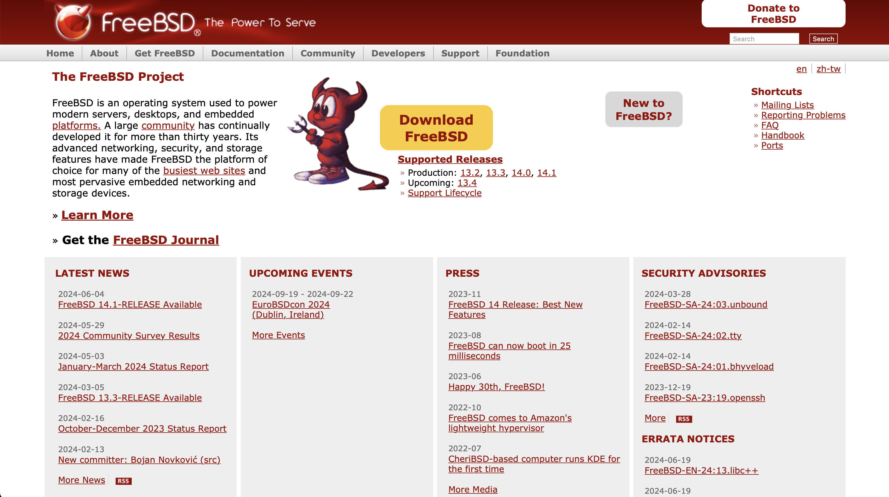
The "Donate to FreeBSD" button on the website has large side margins, which cause the text on the button to break into two lines, which in turn causes the button to not have any spacing from the top edge of the top bar, and the search form to not have any spacing from the bottom. I believe this is unintentional, especially as man.freebsd.org does not have this problem.
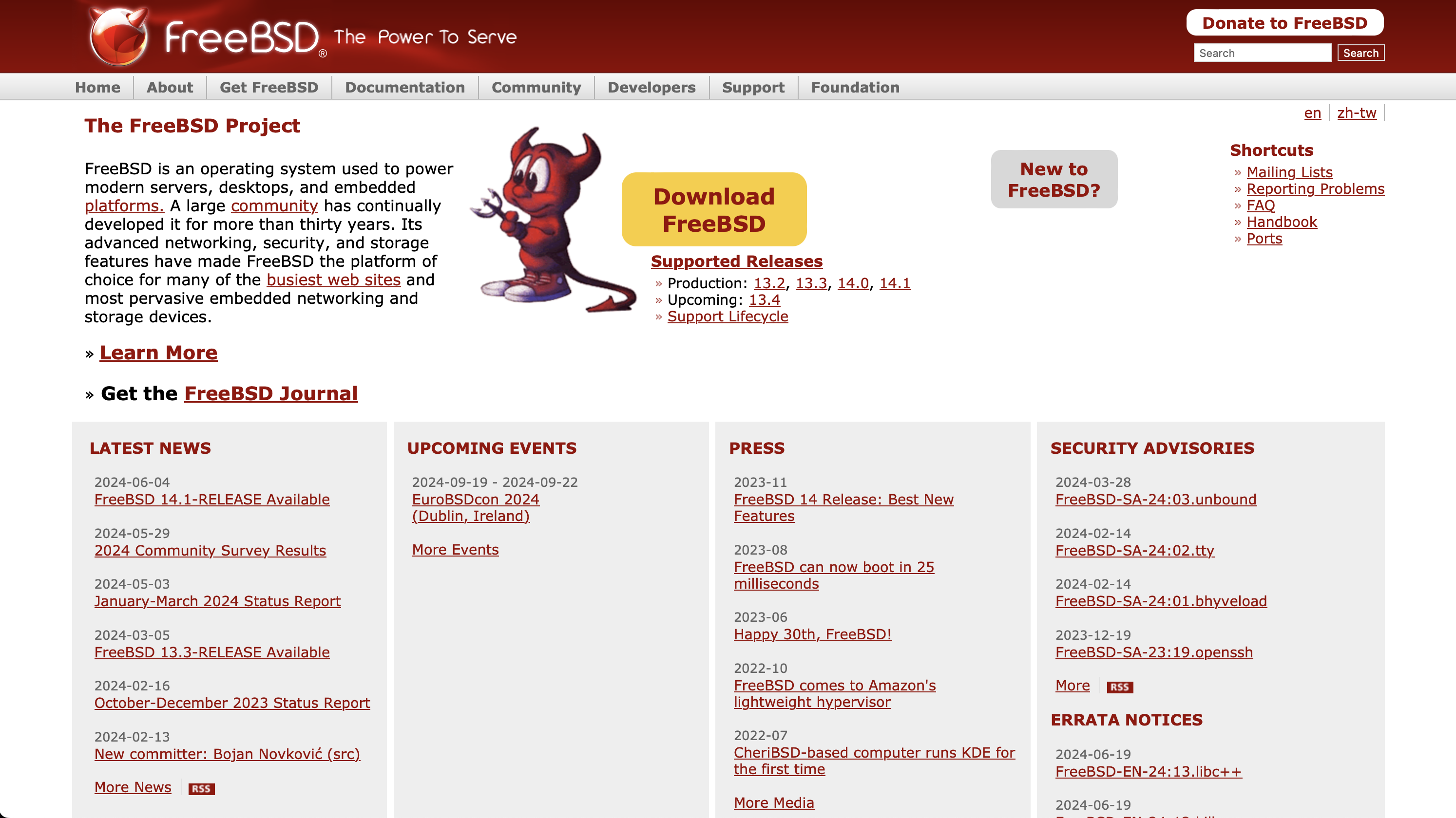
This proposed change decreases the margin and makes some small further adjustment.
| Before | After |
|---|---|
 |  |